Choosing A Home
Part III
{From the 2024 Spring magazine}
Click Here to Read Part I
Click Here to Read Part II
Written By Cindy Conaway | Photos Provided
After a quiet winter, Mike Pugh called us in May. It was time to start working with the vendors. Each time we paid a visit, more of the house was done. Between a house sale, some engagement gifts, and my promotion to Full Professor, we had money to do some upgrades--within reason.
I am confident in my taste and had fun choosing things. We didn’t want our house to be cookie-cutter despite the houses in the development all being built by Cerrone. But there were many moving parts; we needed to avoid costly and ugly mistakes. Designers I liked used subtler palettes than my tendencies, and expensive, hard-to-take-care-of materials like marble. We stuck with the “mid-century-modern meets world-traveler” concept, but at each choice I kept thinking “beach house.”
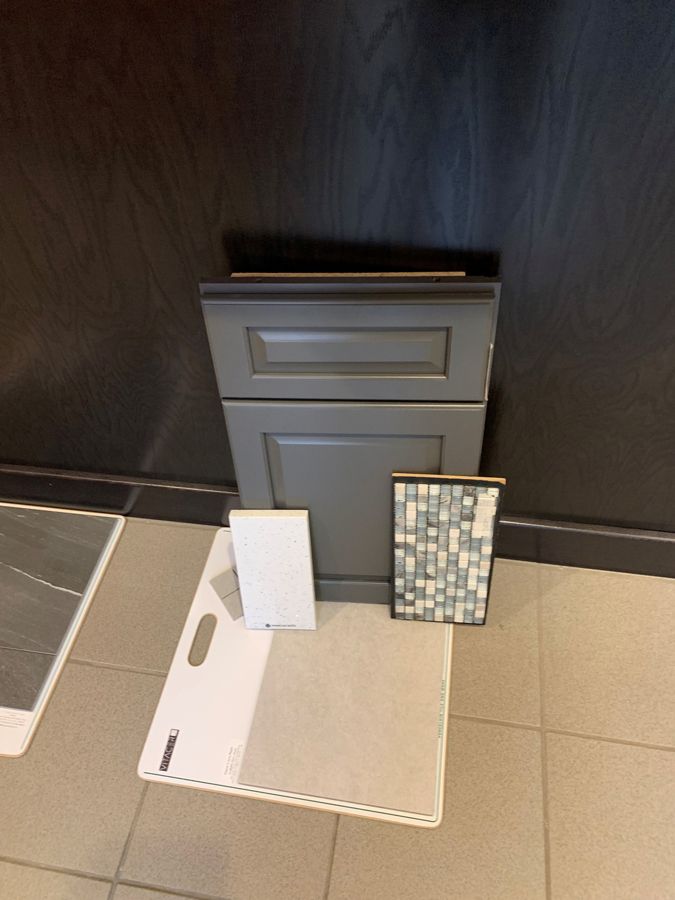
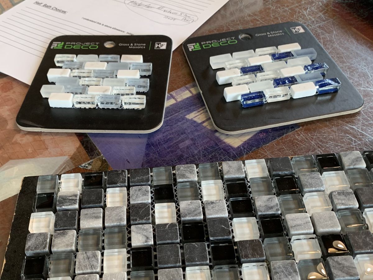
First up, tile. For the guest bath, we stuck with the aquatic-colored “Waterfall” mosaic I first liked, white subway tile and “Pearl” floor tile. Although I had ordered vibrant mosaic samples, when I mocked them up in my Spoak software, they looked too much like YMCA showers, so I decided on more subtle “variations on a theme” in the primary bath. Marc at Queensbury Tile found us a black, white and gray mosaic and an anthracite floor. Although I wanted a kitchen backsplash, which TV designers always had, he recommended waiting a while and going subtle because “granite is the star.”
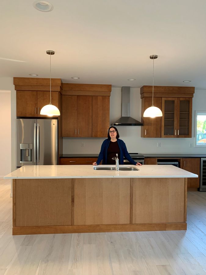
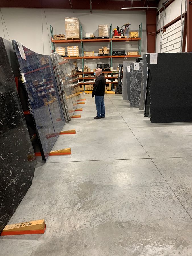
We took our samples to Adirondack Precision Cut Stone, the “Blue Pearl” granite I originally wanted for the island felt dated—Tina was clearly relieved. She found us a white quartz with blue veining for the island and “Absolute Black” on the back counters—an affordable way to get the look we wanted. Remnants were now available; for the guest bath, “Sparkling White” with flecks of sea glass matched the mosaic. Although zebra-striped “Tuxedo” quartzite for the primary bath was too expensive, there were just enough remnants of Livorno—black with white streaks—for a vanity top and shower bench.
We then brought all the samples back to Best Kitchens, where Rick had already mocked up a kitchen design including drawers for heavy dishes, a “spices and oils” pull out cabinet, and a pop-up for our food processor. We asked to reorganize cabinets to allow for a cat-feeding area and to add glass doors to two cabinets to display wine glasses and what my dad calls “home decors” without the kittens—now larger but no less destructive -- being able to get at them. With two counter colors, he suggested unifying cupboards and island color. Praline-stained maple matched our walnut furniture. For bathroom vanities, we choose a lighter gray to coordinate with the darker tiles and a darker gray for the lighter tiles. And we ordered a 1950’s-style Formica counter and sink for the mudroom. GE Profile appliances entitled us to multiple rebates. The internet was aflame (pun intended) with stories about prohibitions on gas, and I get frustrated with electric, so we went with an induction stove.
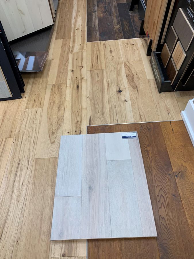
Next destination for the samples was Floormaster. The dark “Longview” floor we had previously considered didn’t look right anymore. I’d also learned that lighter wood floors were easier to take care of. The blonde “Pelican Bay” from the builder’s choices gave a Danish modern beach house vibe. Larissa said that other neighborhood clients had liked it but been too scared to choose it, to which I said “sold!”
By the time it came to lights and bathroom mirrors, we had decision fatigue. Gianni and Corey helped us decide where recessed lights and outlets should go. Mary and Angela at Askco Lighting and I sent wish lists back and forth a dozen times, plus multiple visits. I also ordered a dining area light I’d seen in Architectural Digest and outdoor lights from Barn Lights. The guest bath was small and the tub was big, and we had a lot of “design” going on already, so we had them cut plain mirrors to size.
I went back to Spoak and mocked it up again. Everything seemed harmonious and like it would look more luxe than it was. It was almost time to move!