
Color, Color and More Color! It’s all coming back! I just love… Color!!
If you’re afraid of color, now is the time to get over this obstacle and embrace the vibrant palette for 2023!! You know I just love Benjamin Moore colors, but this year they have hit the nail on the head with hues to entice a positive vibe into the new year and accelerate our homes into a glorious celebration of new beginnings!
For openers, Benjamin Moore has launched their color palette with Raspberry Blush 2008-30 as color of the year… “a saturated red-orange that enlivens our surroundings while awakening our senses with charismatic color. This vivacious color is unapologetic in its boldness as it encourages a confident color statement,” as announced in BM’s press release last October. We have been starving for more color, awakening from the grays that have been in the forefront for more than a decade now. Color is exciting; it breathes new life into a home or office! It’s bold and confident…so let’s get out our paint rollers and take a deeper look at what this year holds for YOUR next project!

But before we get into the nitty gritty, I’d like to start by educating you about the color wheel. I know most of you have seen a typical color wheel, but what about one that goes into the minutia of secondary and tertiary colors? This may take a little pressure off your breaks on color, and give you more confidence to be courageous in 2023!
With the primary colors being red, blue and yellow, secondary colors are those found between, and a mix of, two primary colors such as orange being a mix of red and yellow. Tertiary is where many get lost…
However, this marvelous color wheel (see Color Wheel #1) depicts how any of the primary colors, mixed with a secondary color NEXT TO IT can create a tertiary color such as blue and green converging to create a blue-green or yellow and green to create yellow-green. Now, when we look at color and how to work them together, it's as simple as using 3 colors NEXT to each other (Analogous colors) or 2 colors ACROSS from each other (complimentary colors). Yes, there are also monochromatic schemes as well, meaning, the use of one color (also known as hue) ranging between lighter and darker variations of the base color. Lastly, only speaking on a simplified scale, we have warm versus cool colors (see Color Wheel #2). I love to remember anything mixed with sunshine or red hot chili peppers would be considered warm…believe me, a lot of people think of warm weather with green grass and blue skies and think “warm”…but not on the color wheel! Did a few light bulbs go on in your head? Great…now let’s get back to the 2023 color trends with all this in mind, shall we?
Raspberry Blush 2008-30 is a warm color and described as “saturated” by Benjamin Moore, meaning, the color is vivid and intense rather then muted like many of the colors we have experienced in past 10-12 years. It’s mix of Red-orange (red being the dominating color and therefore mentioned first) sets a room with vibrance and spontaneity. While the red draws you into the space with its allure of mystery, the orange undertones soften the environment making it welcoming and soothing. In this living space, Raspberry Blush is paired with Etiquette AF-50, the warmer “white” of the 2023 collection. Ah ha! You did see it! Yes…both of these colors work so well as they are both WARM! The eye responds to this “like” combination and senses the ease of the pairing. I personally love how the Etiquette simplifies the Raspberry Blush without diminishing its character!


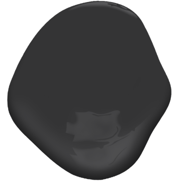
(above) Onyx 2133-10
(left) Savannah Green 2150-30
If you review color wheel #2, top of the yellow as it crowds into the green hemisphere, you’ll get a glimpse of Savannah Green 2150-30.
Warm and inviting with a hint of coolness to keep even the hottest of days at bay. Mature and illustrious, it pairs well with Onyx 2133-10 (door) adding mystique to any space. Such sophistication and yet so simple!
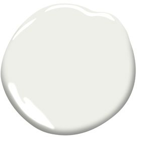
(above) White Heron OC-57
(left) Conch Shell O52
Onto Conch Shell O52 with another red-orange mix yet less saturated than Raspberry Blush but with greater lightness.
Alone, this color typifies the interior of a conch…
breathy, full of spirit and Sweet to behold.
When paired with warmer elements such as wood, more of the red undertones are peaked while off-whites such as White Heron OC-57 seem to pull on the orange strings a bit tighter.
(above) White Heron OC-57
(left) Starry Night Blue 2067-20
Starry Night Blue 2067-20 immediately brings to mind Vincent van Gogh’s painting, and the song written in homage to the painter; “Starry, Starry Night” by Don McLean.
The color embodies a sky that beckons us into evening, but before we go, this luminescent blue strikes a chord just as the sun is setting into the horizon. Applied in high gloss, this color adds drama to this bath, offset by White Heron OC-57 and minimal elements of textural wood. Creating a mostly monochromatic atmosphere embodies the experience of bathing in and throughout water…I can feel myself floating, can you?

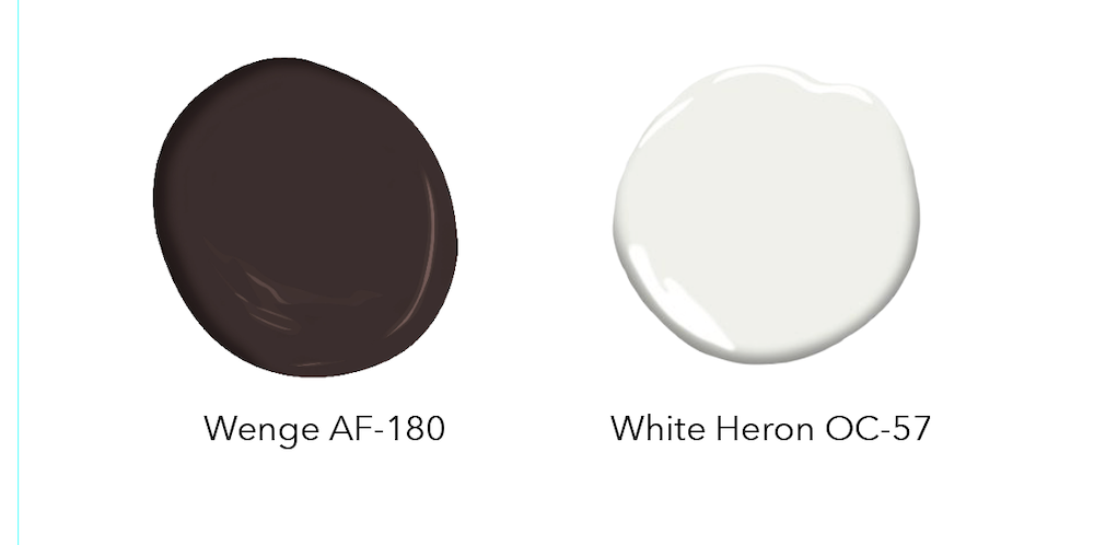
North Sea Green 2053-30 personifies all I love about the European seas…it literally feels as if it could glow, and in some parts of Europe, it actually does! Here, North Sea Green wraps you in the allure of water with its soft waves that bellow and resound in a rhythmic tone. A dining nook, set against the ocean and brought into crispness with a pairing of trim in White Heron OC-57 and grounded with a faux hide rug in a hue of Wenge AF-180... elevating this setting into a contemporary framework with a Saarinen Tulip Table and chairs as the centerpiece. Want to feel the sea right here in your NY home…order up a can and start rolling!


(above left: Cinnamon 2174-20. above right: New Age 1444)
New Age 1444 is yet another color of low saturation but high lightness. Its light tint of pink is dreamy, fluffy like cotton candy without all the sugar to distract you from its beauty. Here, it’s paired with black and white accents, adding a softness to the modern farmhouse look we have adored now for a decade. Even some of my younger clients have been wooed by this hue and have found delight in adding color to their otherwise all white accommodations in fear of missing the mark. Jump right in, I say…it’s like landing on a soft pillow of comfort, a haven that won’t disappoint.
And lastly, Cinnamon 2174-20, truly warmth at its best! Stimulating the senses and appetite, it’s even been known to create a feeling of pure joy while improving concentration and memory! Wow, now that’s a powerful color! Its roots stem as far back as 2000 BC with great value placed on this spice, in fact, it was often a gift for monarchs! Imagine a guest room in this glorious hue! And pairing it with Etiquette AF-50 for the trim and ceiling is like adding whipped cream to your cinnamon spiced cocoa…scrumptious …How fast can you paint that room? I’ll be over next week!
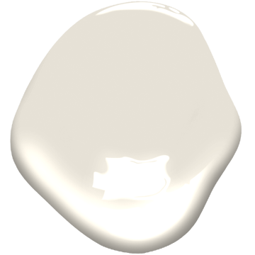 Etiquette AF-50
And with that, you are ready to dive head first into color for 2023! No holding back, just keep that handy color wheel with you and head on over to your favorite Allerdice Ace Hardware to pick up a sample …or several gallons!
Until next time my friends,


