
{From the 2024 Home & Lifestyle Magazine}
Written by Colleen Coleman, CMC Design Studio LLC
Photos Courtesy of Benjamin Moore
I feel as if Benjamin Moore swooped into my home and took pictures of all the colors I adore! Blue & violet (a favorite combination of mine) complimented with touches of yellow and natural terra cotta. Varying shades of greens with reds that read more like a perfect blush to just a hint of color. There’s also a play on light & dark, warm, and cool hues that create the urge to delve into colors beyond where you have daredto go before. It’s an exciting year… challenge your senses to explore how each of these colors can spark a new adventure for you!
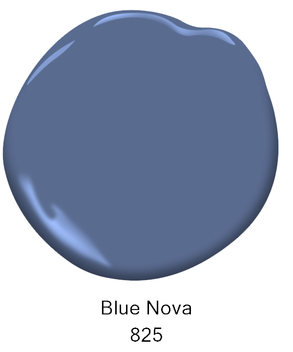 With Benjamin Moore’s 2024 Color of the Year revealed as Blue Nova 825, it immediately invites you to explore the unknown, be more adventurous and seek greater depths in your own space. This cool color which verges on the brink of violet has - of course - a “cosmic” quality, beckoning you to break out of your ho-hum neutral scheme, and invite in a hue that is classic with a hint of modern chic.
With its eye-catching appeal, this medium dark to medium color (16.98%) on the Light Reflective Value scale (LRV) is rich in lush deep colors but still has the ability to reflect color when saturated by natural or artificial light. For instance, if you have a south facing room with windows that cascade upon your walls, this color would dance from morning to night for you! In the early hours, its deep, lush colors are moody and compliment the robust scent of a fresh brewed pot of coffee. As the day awakens and the wall is saturated with daylight, the violet hues emerge with a softer side echoing its mystique of color change. By night, your walls have taken on their own “cosmic” atmosphere of rich blues that embrace you and whisper the night’s call to calm and relaxation. Aren’t blues the best? ...my favorite!


Even as Blue Nova takes the spotlight this year, the nine other colors on the Benjamin Moore palette are far from being second! But let me take a quick pause and delve into the LRV, or Light Reflective Value, I mentioned previously for a minute. Simply put, LRV is the measurement of the amount of light reflected from a surface. The range is 0 to 100, absolute black to pure white respectively. However, in the paint world, the actual scale is 2 - 94. The higher the value, the more the surface color will reflect light; the lower the number, the more the surface color will absorb light. Why would this matter? Of course, any color saturated with direct natural or artificial light will look lighter, right? Wrong! It will be illuminated, yes, but a color in the ”Dark” range on the LRV scale will not reflect any light back into the space. That’s a big difference!
Here’s a quick tip, colors in the Light Medium to White range will reflect back more light than they take in, creating a space that feels larger. Likewise, colors in the Dark to Medium range will absorb more light than they give back to their environment and can make a large space feel more intimate or moody depending on how it’s used. I could go on but alas, our 2024 colors await! Oh, yes, to find the Benjamin Moore LRV’s, just open to the rear of a fan deck and each color is noted with its LRV %. And one last tip...when testing your wall colors, be sure to put a large swatch on each wall, with a white piece of paper behind it, so you can see how the differing lights throughout the day affect your options for color.
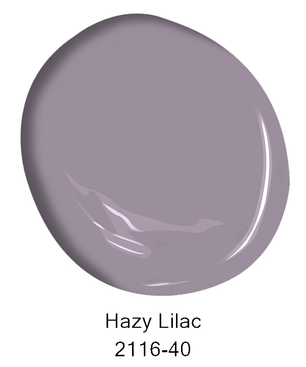
Back to paint colors…Starting with this year’s violet, Hazy Lilac 2116-40 is found to be just creeping into the warm side of the color wheel offering larger rooms a cozy feel and intimacy. With its gray gentleness, it evokes mystery and luxury as most purples have from their ancient history.
With a LRV of 29.15%, it’s a medium color that reflects light, giving this otherwise “gray” violet a warm hue when saturated by the blue light of mid-morning to mid-afternoon natural light. LED light bulbs with a 5000 Kelvin will also create this same feel. If I design an interior room with no windows, such as a central half bath, and violets are incorporated into the space with paints or regal stone surfaces, then I purposely choose a 5000K LED light bulb to enhance the warmer undertones of the violets, showcasing more “reds” to make the color pop in the space.


Complimentary to purple is yellow, and Honey Bee CSP-950 is the perfect companion to Hazy Lilac. Definitely on the warm side of the color wheel, this yellow is quite the chameleon.
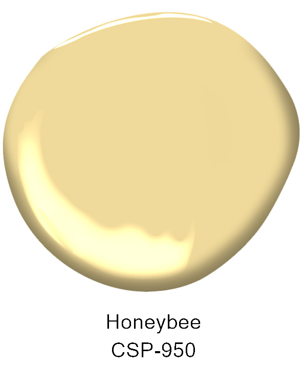
With an LRV at 67.02%, you can actually feel the light reflect off this wall and saturate its color into an almost white as the yellow sun bleaches it amid noon summer skies. But noting that the day begins with eastern yellow hues, this color welcomes you to a personal sunrise in your own private chambers! But take a look at the color wheel…Honey Bee is slightly leaning into orange…as the western sunset collides, this color becomes anew as a rich personal sunset to end your day. My favorite yellow room begins in the east and ends with indirect western light in the evening. No matter where you live, you have a perfectly sunny day!


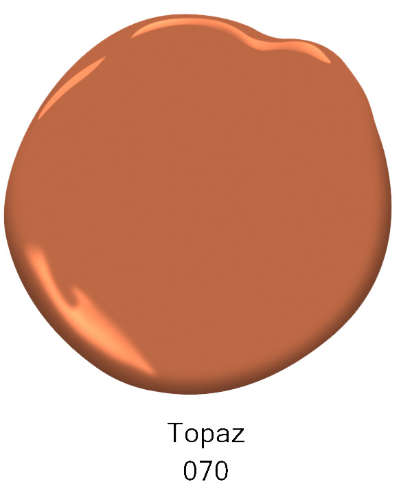
Topaz 070 dives even deeper into the orange spectrum with rich hues reminiscent of old Italian terra cotta pots left in the sun amid rows of herbs and vegetables. This luscious color conveys summer, gardening and earthy tones. With an LRV of 22.37%, this medium color value rests quite peacefully within its own room or as a complimentary color to Blue Nova in linens and drapery. But mind you, as the evening approaches, watch for rich tones of reds to emerge like those of a Jaguar Red Gerbera blossom!

Moving toward a more pastel hue, Teacup Rose 2170-50 highlights the beauty of a Light Medium to Light LRV (60.42%). Its higher reflectivity than the prior noted colors offer a wisp of blush as applied to the face to start a day anew. By mid-day, this color washes clean and softens to a pale breath of pink. As evening sets in, the yellows and reds of a western sunset adds a bit more of the reds to the hue and ends the day with a spectacular view, quite acceptable with your favorite cup of tea! I love the use of this color on the ceiling too, the forgotten wall as we say. The room seems to abound in loftiness, with a tangible excuse to introduce fruit-filled roman shades, artwork and a geometric rug that grounds the room from ceiling to floor.


Getting back to the deeper hues (25.4% LRV), Antique Pewter 1560 upon appearance is a luxurious green, quite splendid when used as an exterior house color, interior walls and cabinetry. I love a great green on mudroom cubbies juxtaposed by an oak bench or details in the trim work. This green actually has a yellow undertone, so when mid-day sunlight adorns its walls, muted blue hues emerge. Overall, when I saw this color, my mind immediately flashed back to the olive groves I saw in Italy. Again, another earthy color that looks fabulous paired with Topaz-like fabrics and cognac leather. It’s most definitely a color your walls won’t waver to be changed anytime soon!


And paired in this photo is Pristine OC-75 for the hallway walls and trim. Again, this color has red-orange undertones which pick up on the cognac chair and make this arrangement very pleasing to the eye. With an LRV of 75.08%, this off-white hue is anything but white. Here’s a great tip for seeing undertones when you just can’t seem to figure out why a color isn’t working for you. Take your paint swatch and place it on a white piece of paper in natural light. You should be able to see how much orange is in this paint dollop compared to the white paper. Undertones are always more visible with comparisons.


Let’s head back to greens but pull that LRV scale way back to dark with Regent Green 2136-20 (6.16%) …now that’s a dark, build me a library kind-of color! With blue undertones, this color is a rich deep green in the morning and evening with deep ocean blues peering in for a respite. I love how the photo highlights this green as the trim and ceiling rather than the walls. Its deep tones accentuate this long, two story sunroom while creating an intimate sitting area amid auburn wooden floors and the large white pendants that are striking in contrast.


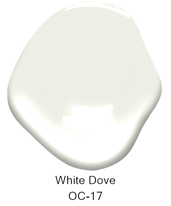
With walls finished in White Dove OC-17 (84.91%), the contrast of light and dark in this room truly creates a cozy atmosphere for curling up with a good book and red wine. Not all whites are created equal. In fact, this white has a smear of yellow in its undertone which gives off a slight warmth as opposed to the coolness of Regent Green. It accompanies the warm floors yet allows the cool trim and ceiling to welcome the large gray sofas, area rug and even the black and white photos above the threshold to the home.
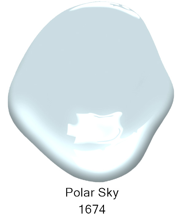
Coming full circle with yet another blue, Polar Skies 1674 is also completely on the other side of the LRV scale (68.77%) of Blue Nova. Quite a cool color, its great for those rooms where temperatures rise in the summer, offering a bit of a siesta from the heat. Remember, higher LRV colors, the light medium to white, do not absorb as much heat as dark colors can. And if you’ve ever looked for a front porch ceiling color, well look no farther…cool, crisp and perfectly suited with lush greens and blue skies.
Get your color on in 2024! Be bold and try a new color…maybe even paint the trim and doors with color in lieu of the walls! It’s time for a change people…take the dive into a new world and allow yourself the freedom color can bring into your home.
Until next time my friends,
Colleen Coleman of CMC Design Studio LLC
Certified Kitchen & Bath Designer
Certified Aging in Place • True Color Expert
@cmcdesignstudiollc